In my fifteen years of navigating the nuances of residential aesthetics, I have encountered one specific challenge more often than any other: the “gloomy” north-facing room. I remember a project early in my career—a stunning Victorian brownstone with soaring ceilings and intricate crown molding. The homeowners were devastated because their favorite “perfect gray” paint, which looked like a crisp morning mist in the showroom, turned into a cold, muddy lilac the moment it hit their north-facing living room walls.
It was a heartbreak I’ve seen repeated in countless homes. North-facing rooms receive the most consistent light throughout the day, but that light is inherently cool and bluish. Without the direct, golden rays of the southern sun, standard neutrals can feel flat, sterile, or even depressing.
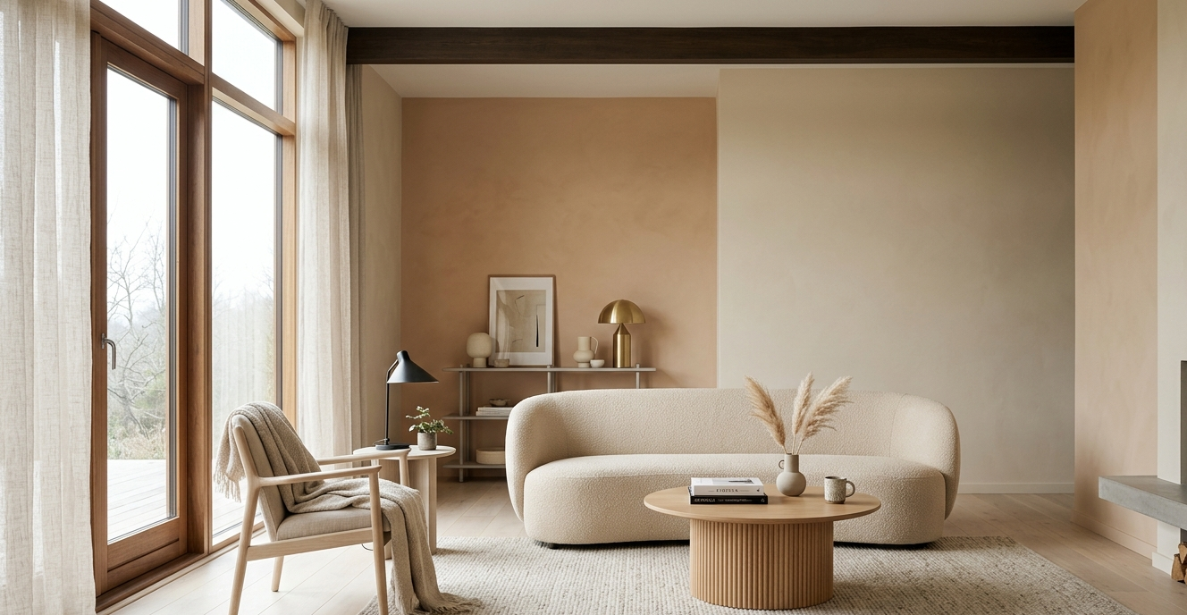
To transform these spaces, we must become alchemists. We aren’t just painting walls; we are “chasing the sun” by injecting warmth, depth, and life back into the architecture. Today, I’m sharing my professional playbook on selecting the best warm neutral paint colors for living rooms with north facing light, ensuring your home feels like a sun-drenched sanctuary, no matter which way your windows face.
Understanding the Physics of Light and Color
Before we dive into my favorite swatches, we have to understand why north-facing light is so “picky.” In the Northern Hemisphere, north-facing windows never receive direct sunlight. Instead, they receive reflected light from the sky.
The Blue Light Trap
Because this light is pulled from the blue end of the spectrum, it acts as a filter over your walls. If you choose a “cool” neutral (one with blue or green undertones), the room will feel icy. If you choose a “true” white, it will often look gray and shadowy. To counteract this, we need pigment-heavy neutrals with undertones of yellow, pink, peach, or gold. These warm undertones “cancel out” the blue light, resulting in a balanced, creamy finish that feels intentional rather than accidental.
The Power of LRV (Light Reflectance Value)
In my experience, homeowners often think that “brighter is better” for dark rooms. However, a high LRV (closer to 100) can actually make a north-facing room look washed out and “hollow.” Sometimes, opting for a mid-tone neutral with a bit more chroma (intensity) provides the visual weight needed to make the room feel cozy rather than just dim.
The Evolution of the Warm Neutral
We’ve come a long way since the “builder’s beige” of the early 2000s. The modern warm neutral is a sophisticated blend of earthiness and light.
- The Greige Era (2010-2018): This was a reaction to the yellow-heavy beiges of the past. While greige is versatile, many versions (like the famous Revere Pewter) can still lean too cool for northern light.
- The New Organic Neutral (2020-Present): Today, we are seeing a shift toward “mushroom,” “oatmeal,” and “terracotta-tinted whites.” These colors prioritize textural contrast and emotional resonance, making a room feel lived-in and soulful.
In my styling practice, I’ve found that the most successful north-facing living rooms use a palette that mimics natural materials—think sun-bleached linen, raw clay, and weathered stone.
Deep Dive: Master the Palette (Hex Codes & Undertones)
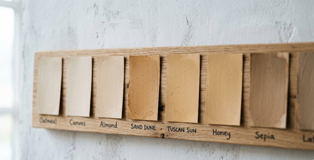
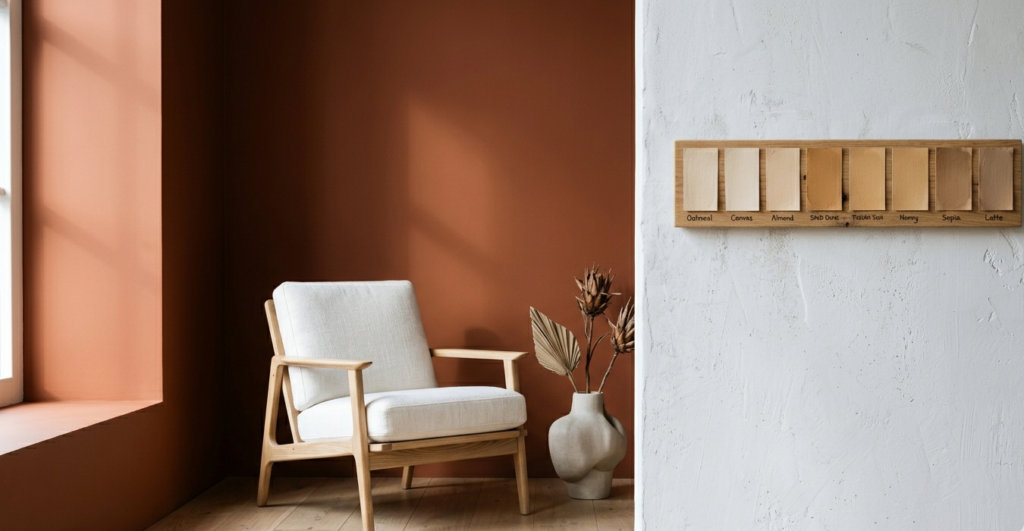
When selecting the best warm neutral paint colors for living rooms with north facing light, you must look beyond the primary label. Here are four professional-grade palettes I personally swear by, broken down by their visual impact.
1. The “Creamy Cloud” Palette
This is for the homeowner who wants a “white” room without the clinical chill.
- The Hero Color: Benjamin Moore White Dove (OC-17)
- Hex Code: #F2F2E8
- Why it works: It has a tiny hint of yellow and gray. In northern light, the gray keeps it from looking “lemon,” while the yellow provides the warmth.
- Textural Pairing: Pair this with bouclé fabrics and light oak floors to create a soft, ethereal vibe.
2. The “Desert Sand” Palette
If you want a room that feels like a warm embrace at sunset, look for “nude” neutrals.
- The Hero Color: Sherwin Williams Shoji White (SW 7042)
- Hex Code: #E6E1D4
- Why it works: This is a “chameleon” color. It sits perfectly between a greige and a cream. It has enough pigment to stand up to shadows without turning muddy.
- Textural Pairing: This looks stunning against brass hardware and cognac leather.
3. The “Mushroom & Stone” Palette
For those who prefer a bit more drama and depth, we look toward the “stone” neutrals.
- The Hero Color: Farrow & Ball Jitney (No. 293)
- Hex Code: #C9BAA6
- Why it works: Jitney is an incredibly earthy, muted sand color. It was designed to mimic the colors of the coast, and it thrives in rooms with low light by providing a grounded, “enveloping” feel.
- Textural Pairing: Use heavy linen drapes and jute rugs to lean into the organic, coastal aesthetic.
4. The “Blush Beige” Palette
Don’t be afraid of a pink undertone! It is the ultimate antidote to blue light.
- The Hero Color: Sherwin Williams Malted Milk (SW 6057)
- Hex Code: #D8C7B9
- Why it works: It’s a beige with a “glow.” In a north-facing room, the pink undertone reads as a healthy, warm tan rather than “Barbie pink.”
- Textural Pairing: Complement with walnut wood and charcoal accents for a sophisticated, modern look.
The Curator’s Choice: 5 Essentials for the North-Facing Home
Color is the foundation, but accessories are the architecture of a room’s mood. To truly conquer a north-facing space, I recommend these five specific elements:
- The Oversized Arched Mirror:
- Why: A mirror shouldn’t just be a focal point; it’s a light-multiplier. Position it opposite your north-facing window to catch whatever ambient light is available and bounce it back into the center of the room.
- The Amber Glass Vessel:
- Why: When light passes through amber glass, it physically warms the “color temperature” of the light. Placing a few of these on a windowsill or coffee table acts as a visual sun-trap.
- The Mohair Throw in “Oatmeal”:
- Why: Texture creates shadows, and shadows give a room depth. A high-sheen mohair throw adds a layer of “visual warmth” that a flat cotton blanket simply cannot provide.
- Warm-Dim LED Bulbs (2700K):
- Why: This is a non-negotiable. If you use “Daylight” bulbs (5000K) in a north-facing room, you will ruin your paint job. Stick to 2700K to 3000K to keep the atmosphere golden and inviting after the sun goes down.
- The Live Olive Tree:
- Why: The silvery-green leaves of an olive tree are a perfect natural “cool” element that actually highlights the warmth of your neutral walls through chromatic contrast.
Room-by-Room Application: Implementing the Look
The Living Room: Creating Spatial Flow
In the living room, your goal is to manage the spatial flow between the seating areas. Use your warm neutral on the walls, but take it a step further: paint your ceiling in a 50% “cut” of the wall color. This eliminates the harsh “white lid” effect and makes the room feel taller and more cohesive.
The Bedroom: The Sanctuary Effect
For a north-facing bedroom, I often suggest going slightly darker than you would in the living room. Think of a “taupe” or “warm mushroom.” Since we primarily use bedrooms at night, we want to lean into the “enveloping” quality of these colors. Layering tonal textiles—a mix of silk, velvet, and linen in the same color family—creates a rich, sensory experience.
The Kitchen: Balancing the “Hard” Surfaces
Kitchens are full of “cold” materials: stainless steel, stone counters, and tile. If your kitchen faces north, white cabinets can look stark. I recommend a “warm putty” or “parchment” color for cabinetry. It provides a beautiful focal point when paired with unlacquered brass hardware, which will patina over time and add even more warmth to the space.
You might also enjoy:
- The Magic of Color: Ultimate Accent Wall Guide
- The Rug Layering Guide: Adding Bedroom Texture
- Greenery for Everyone: 7 Low-Light Indoor Plants
Pros and Cons: Warm Neutrals in Low Light
| Feature | Pros | Cons |
| Visual Harmony | Eliminates the “dreary” blue cast common in northern rooms. | Can sometimes look too “yellow” if the sun unexpectedly comes out. |
| Psychological Impact | Creates a sense of coziness and safety (“The Nest”). | May feel “closed in” if you don’t use enough mirrors or glass. |
| Furniture Pairing | Works beautifully with almost all wood tones (Oak, Walnut, Teak). | Can make white-washed or “gray” wood furniture look disconnected. |
| Maintenance | Warm-toned neutrals hide dust and scuffs better than “stark white.” | Requires careful bulb selection to maintain the color’s integrity at night. |
How to Implement: Your Step-by-Step Guide
- The “24-Hour” Swatch Test: Never choose a color in the store. Paint a 2×2 foot board and move it around your north-facing room. Look at it at 8 AM, 12 PM, and 8 PM.
- Mind Your Trim: In a north-facing room, I often recommend “Color Drenching”—painting the walls, trim, and doors the same color, but in different sheens (Eggshell for walls, Satin for trim). This removes visual clutter and makes the room feel more expansive.
- Address the Flooring: If you have gray-toned flooring, your warm neutral walls might clash. Use a large, warm-toned area rug (think beige, tan, or terracotta) to bridge the gap between the floor and the walls.
Final Thoughts: The Expert’s Secret
In my fifteen years of styling, I have learned that a room’s “flaw” (like a lack of sun) is often its greatest opportunity. A north-facing room has a quiet, steady, and painterly quality that south-facing rooms lack. By choosing the best warm neutral paint colors for living rooms with north facing light, you aren’t fighting the shadows—you are dancing with them.
Expert Tip: If a color still feels a bit flat after you’ve painted, don’t repaint! Add one single “pop” of a saturated warm color, like a burnt orange pillow or a deep burgundy vase. This tiny bit of high-intensity color will “pull” the warmth out of your neutral walls, making the whole room vibrate with life.
Ready to transform your space? Grab a few samples of the colors mentioned above and start your own “sun-chasing” journey. For more interior design inspiration and deep dives into color theory, subscribe to the Smart Renovation Guide newsletter below!