I still remember the first project where I truly “failed” at mixing patterns in home decor without overwhelming the room. I was three years into my career, working on a bright, airy brownstone in Brooklyn. I had found this stunning oversized botanical wallpaper and paired it with a vibrant geometric rug and striped pillows. On paper, it looked like a high-fashion editorial. In reality? It looked like the room was shouting at itself.
That project taught me the most valuable lesson in my 15-year career: pattern mixing isn’t about being loud; it’s about conducting an orchestra. Each print has a “voice,” and if they all sing at the same volume, you just get noise.
Today, I’m pulling back the curtain on how designers create those effortlessly “tossed together” looks that are actually meticulously planned. Whether you are a maximalist at heart or a minimalist looking to add a bit of soul to a sterile space, mastering the art of the print is your ticket to a home that feels curated, not just decorated.
The Evolution of Pattern: From Traditional To Eclectic
Before we dive into the “how,” it’s helpful to understand the “why.” Historically, patterns were used to signal status and global influence. Think of the intricate Toile de Jouy from 18th-century France or the geometric Kilims of Central Asia.
In the past, the “rule” was often to stick to one family of patterns—florals with florals, stripes with stripes. However, the modern aesthetic has shifted toward eclecticism. Today, we celebrate the juxtaposition of a sharp, modern chevron against a soft, organic watercolor floral. This shift represents a move toward personal storytelling in our homes. We aren’t just buying a set; we are collecting experiences.
The Golden Rules of Mixing Patterns in Home Decor Without Overwhelming the Room
To keep your space from feeling like a circus tent, I always lean on a few foundational principles. These ensure spatial flow and visual rest.
1. The Rule of Three (The Magic Number)
If you’re just starting, stick to three different patterns in one space:
- Pattern 1: Your large-scale “Hero” print (usually a floral or organic shape).
- Pattern 2: A medium-scale geometric or stripe (half the size of the first).
- Pattern 3: A small-scale “accent” print (a micro-dot or a textured weave).
2. Vary Your Scale
This is where most DIYers go wrong. If you have three patterns of the exact same size, the eye doesn’t know where to land. By varying the scale, you create a focal point and allow the smaller prints to act as a neutral background for the larger ones.
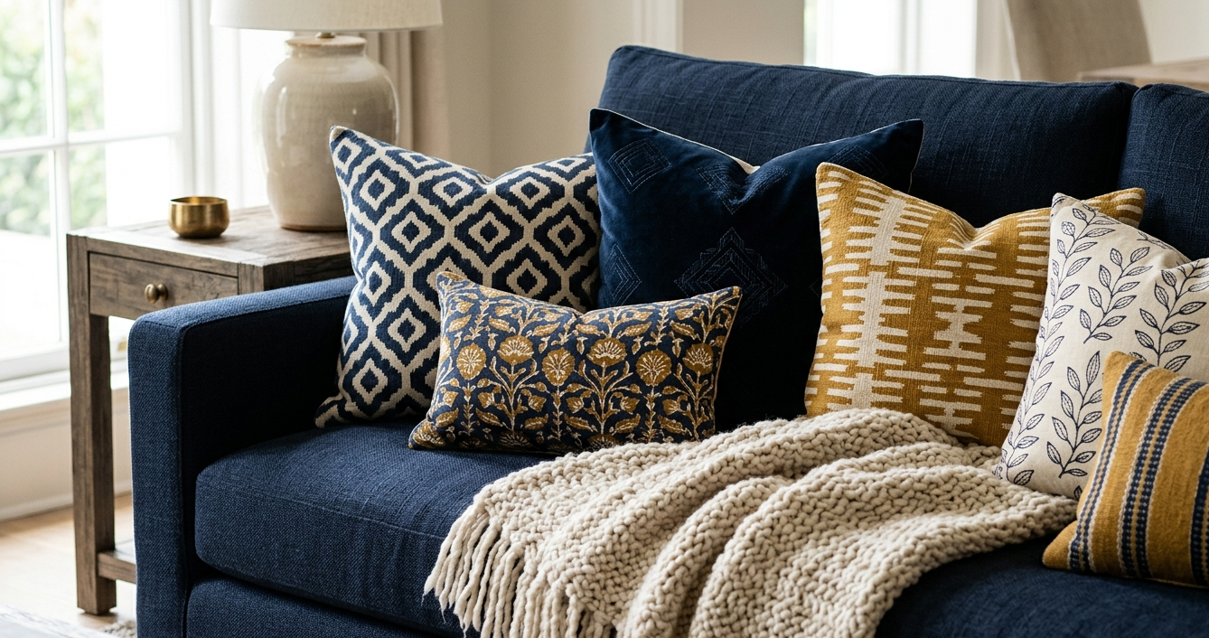
3. Maintain a Common Color Thread
Even if your patterns are wildly different (say, a leopard print and a plaid), they will harmonize if they share at least one color. I find that keeping the background tone (the “ground” color) consistent across different fabrics is the secret to a professional look.
A Deep Dive into Color, Texture, and Fabric Choices
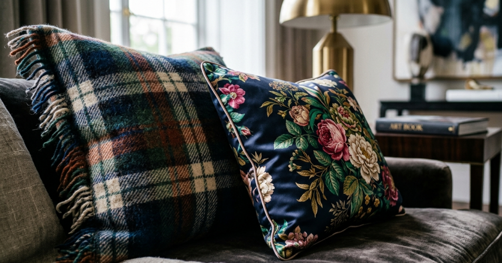
When I sit down with a client to pull a “scheme,” we don’t just look at prints; we look at the textural contrast. A flat cotton print next to another flat cotton print feels cheap. A velvet ikat next to a crisp linen stripe? That feels like luxury.
The Psychology of the Palette
Color is the glue that holds your patterns together. In my experience, working with a tonal palette (varying shades of one color) is the easiest way to mix patterns without stress.
Pro Tip: The “Rule of 60-30-10”
- 60% of your room should be a dominant color (usually a neutral or a soft tone).
- 30% is your secondary color (where your medium patterns live).
- 10% is your accent color (the “pop” found in your small-scale prints).
Expert Color Palette Recommendations (Hex Codes)
For a timeless, designer-approved look, try these combinations:
| Theme | Primary (60%) | Secondary (30%) | Accent (10%) |
| The Modern Coastal | #F5F5F5 (Crisp White) | #003366 (Navy Blue) | #D2B48C (Sandy Tan) |
| The Earthy Organic | #E2DFD2 (Soft Bone) | #4B5320 (Olive Green) | #8B4513 (Saddle Brown) |
| The Parisian Loft | #FFFFFF (Pure White) | #2F4F4F (Dark Slate) | #DAA520 (Goldenrod) |
The Importance of Fabric Weight
Mixing prints isn’t just a visual game; it’s a tactile one.
- Jacquards and Brocades: These are heavy, formal, and carry a lot of visual weight. Use these for your “Hero” patterns on upholstery.
- Linens and Cottons: These are “breathable” prints. They work beautifully for window treatments or casual slipcovers.
- Velvets: A solid velvet acts as a “visual palette cleanser” between two busy patterns.
Textural Contrast: The Secret Sauce
If you have a very busy, colorful pattern, try pairing it with a monochromatic textured print. For example, a raised “popcorn” weave in a single color can act as a pattern without adding more color chaos. This creates depth and textural contrast that makes a room feel expensive.
Room-by-Room Application: Pattern in Practice
The Living Room: The Multi-Layered Approach
The living room is the heart of the home, and it’s where you have the most “real estate” for patterns.
- The Anchor: Start with a patterned rug. A low-contrast Persian or an understated geometric provides a foundation.
- The Mid-Level: Use your sofa for a solid or a very subtle texture, then go bold on the armchairs.
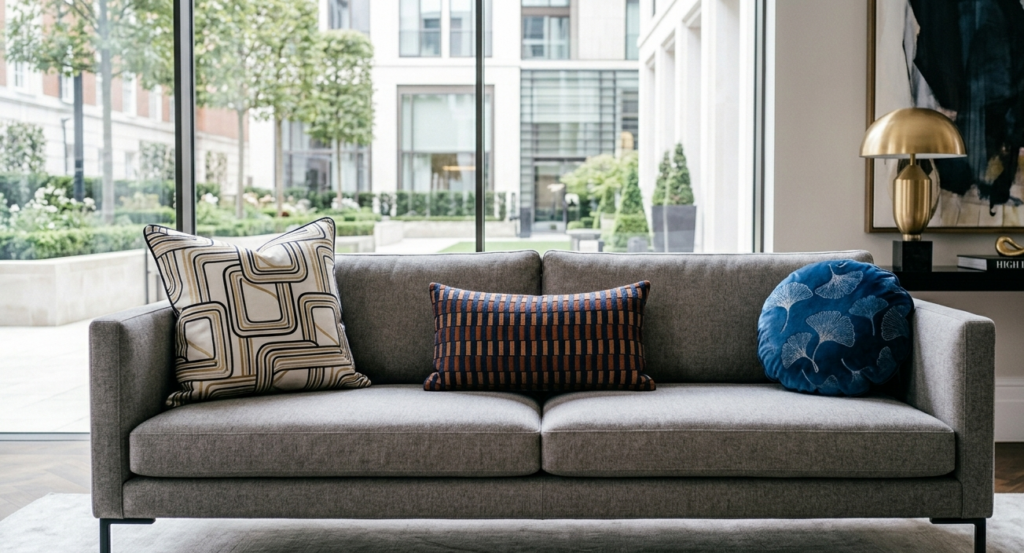
- The Accents: This is where you play with pillows. I like to “sandwich” patterns—place a large-scale print pillow behind a smaller, busier one.
The Bedroom: The Sanctuary of Softness
In the bedroom, we want visual interest without overstimulation.
- The Headboard: A subtle ticking stripe or a small-scale block print works beautifully here.
- The Bedding: I love a large-scale duvet cover paired with smaller-scale patterns on the shams.
- The Bench: An upholstered bench at the foot of the bed is the perfect place for a high-contrast geometric to “wake up” the space.
The Kitchen: Functional Patterns
Many people forget that the kitchen can handle pattern play too!
- The Backsplash: This is your “Hero” print. A Moroccan encaustic tile or a herringbone marble.
- Window Treatments: A Roman shade in a classic gingham or a botanical print can soften the hard lines of cabinetry and stone.
- The Island: Patterned barstools are a designer favorite for adding personality to a white kitchen.
You might also enjoy:
- The Magic of Color: Ultimate Accent Wall Guide
- Luxury on a Budget: 10 Small Accents That Elevate
- The Truth About Washable Rugs: Worth the Money?
The Curator’s Choice: 5 Accessories to Master Pattern Mixing
Choosing the right pieces to carry your patterns is as important as the patterns themselves. Here are my top five picks for pieces that handle prints beautifully:
1. The Oversized Ottoman
Instead of a coffee table, use a large, upholstered ottoman. It’s a massive canvas for a bold, large-scale ikat or a traditional kilim.
- Why it works: It breaks up the “sea of wood” often found in living rooms.
2. The Statement Gallery Wall (with Patterned Mats)
Don’t just frame art; frame pattern. Using scraps of designer wallpaper or high-end fabric as matting for black-and-white photos is a sophisticated way to introduce small bursts of print.
3. The Block-Print Throw
A hand-blocked Indian cotton throw is a staple in my design kit.
- Why it works: The organic, slightly imperfect nature of block printing makes it the perfect “bridge” between more rigid geometric patterns.
4. The Ceramic Lamp
A ginger jar or a lamp with a hand-painted motif provides a pattern on a 3D surface. This adds a layer of sophistication that flat fabrics can’t achieve.
5. The Layered Rug Duo
Place a smaller, patterned wool rug (like a vintage runner) over a larger, neutral jute or sisal rug.
- Why it works: It defines a space (creating spatial flow) while introducing pattern in a way that feels grounded and intentional.
Pros and Cons of a Pattern-Heavy Design
Before you go all-in on “Pattern Play,” let’s look at the functional reality.
The Pros (The Visual Rewards)
- Hides Wear and Tear: Patterns are incredibly forgiving. A spilled glass of wine or a pet’s muddy paw print is much harder to spot on a busy floral than on a solid cream sofa.
- Expresses Personality: Prints tell a story. They can make a brand-new “cookie-cutter” home feel like an inherited estate with decades of history.
- Adds Depth: Patterns create a “push and pull” in a room, making small spaces feel larger and large spaces feel cozier.
The Cons (The Functional Challenges)
- Visual Fatigue: If not balanced with enough “white space” (blank areas for the eye to rest), a patterned room can become exhausting to live in.
- Trend Sensitivity: Very specific, trendy prints (like the chevron craze of 2012) can date a room quickly.
- Maintenance: Some intricate patterns are woven (like damasks), which can be prone to snagging if you have cats or young children.
Finding Your Focal Point
In every room I design, I identify one focal point. When mixing prints, you must decide which pattern is the “Star” and which are the “Supporting Cast.”
If you have a stunning, floor-to-ceiling floral curtain, your rug should probably be a more muted, secondary pattern. If your rug is a vibrant, multi-colored masterpiece, keep your window treatments and furniture upholstery more restrained. The goal is a conversation between pieces, not a shouting match.
Expert Tips for the Final Polish
- Don’t Forget Solids: A common mistake is using too many patterns and forgetting that solids are the “glue.” A solid-colored pillow or a plain throw blanket provides the necessary visual rest.
- Trust Your Gut, Then Edit: I always tell my clients to “over-layer” first. Throw all the patterns you love onto the sofa. Then, take one away. Usually, that one final “edit” is what makes the room feel professional.
- Black is a Neutral: In my experience, adding a small touch of black (a black stripe, a black frame, or a black pattern) helps “ground” a room and makes all the other colors and prints pop.
Conclusion: Your Home, Your Masterpiece
Mixing patterns is one of the most rewarding aspects of interior design. It’s where your home stops looking like a showroom and starts looking like you. By focusing on scale, color harmony, and textural contrast, you can create a space that is vibrant, sophisticated, and—most importantly—uniquely yours.
My Final Expert Tip: If you’re nervous, start with the “Inside-Out” method. Choose a multi-colored patterned pillow you love, and pull the colors for the rest of the room’s patterns directly from that one piece. It’s a fail-safe way to ensure harmony.
Ready to transform your space?
I’d love to see your pattern-mixing wins! Share your photos with us on social media using #SmartRenovationPlay or drop a comment below with your biggest design challenge. Let’s make your home a masterpiece, one print at a time.