I still remember the first “real” apartment I moved into after a decade of design school and junior decorating roles. It had soaring 12-foot ceilings and walls that felt like an endless, intimidating white void. I had a collection of mismatched sketches, a few vintage postcards, and a stunning botanical print I’d found in a Parisian flea market. But I was terrified of the “Swiss cheese” effect—that moment of realization that you’ve drilled twenty holes into a rental wall and not one of them is level.
In my 15 years as an interior designer, I’ve learned that a gallery wall isn’t just a collection of frames; it’s a visual biography. It tells the story of where you’ve been and what you love. Today, I’m sharing everything I know about gallery wall layout ideas for beginners with no-drill solutions, so you can transform your space without the commitment of a hammer and nail.
The Evolution of the Curated Wall: From Salon Style to Modern Minimalism
The concept of the gallery wall isn’t a modern Instagram trend. It finds its roots in the 16th-century French Salons, where paintings were hung from floor to ceiling, squeezed together so tightly that the wall itself disappeared. It was a display of wealth, culture, and abundance.
Today, the gallery wall has evolved to prioritize spatial flow and visual breathing room. We’ve moved away from the stuffy, rigid grids of the past and embraced a more “collected” aesthetic. Whether you’re leaning into the organic chaos of “Eclectic Maximalism” or the restrained beauty of “Japandi,” the goal remains the same: to create a focal point that draws the eye and anchors the room.
Mastering the Elements: Textures, Colors, and Palettes
When I sit down with a client, the first thing we discuss isn’t the layout—it’s the sensory palette. A gallery wall fails when it feels “flat.” To avoid this, we must play with textural contrast.
The Role of Texture in Wall Decor
In my experience, a gallery wall that only uses flat paper prints feels clinical. To bring it to life, I recommend integrating 3D elements. Think of a small woven basket, a brass wall sconce, or a vintage wooden plate.
- Matte vs. Gloss: Use a mix of non-reflective glass and high-gloss finishes to create depth when the afternoon sun hits the wall.
- Fabric Insets: One of my favorite “designer secrets” is framing high-quality fabric scraps—velvets, linens, or even a piece of an heirloom silk scarf.
Curating Your Color Story
The most successful gallery walls have a “tether”—a color that appears in every piece, even if subtly. If you’re feeling lost, start with these three designer-approved palettes:
1. The Earthy Minimalist (Japandi Vibes)
This palette focuses on serenity and organic warmth.
- Soft Sand:
#E6D5C3 - Muted Sage:
#8A9A5B - Charcoal Ash:
#36454F - Pairs well with: Light oak frames, linen matting, and dried botanical presses.
2. The Moody Midnight (Dramatic & Sophisticated)
Perfect for a dining room or a cozy study.
- Deep Navy:
#000080 - Burnt Sienna:
#E97451 - Antique Gold:
#CFB53B - Pairs well with: Dark walnut frames, oil paintings, and brass accents.
3. The Modern Gallery (Clean & High-Contrast)
The classic “New York Gallery” look.
- Pure White:
#FFFFFF - True Black:
#000000 - Cool Grey:
#808080 - Pairs well with: Thin metal frames, black and white photography, and oversized white borders.
The Curator’s Choice: 5 Essential Accessories for Your Gallery Wall
In my decade-and-a-half of styling, I’ve found that the “supporting cast” is just as important as the art itself. Here are my top five picks for elevating your display:
| Accessory Type | Why It Works | Styling Tip |
| Wide-Margin Mats | Creates an instant “high-end” look. | Use an 8×10 print in a 16×20 frame with a custom-cut mat. |
| Picture Ledges | The ultimate no-drill “cheat code.” | Lean frames of different heights; overlap them for a casual, layered look. |
| Wireless LED Picture Lights | Adds drama and highlights specific pieces. | Choose a brass finish to add a touch of vintage luxury without wiring. |
| Acrylic Floating Frames | Makes the art look like it’s suspended in air. | Use these for irregular items like pressed flowers or ticket stubs. |
| Decorative Wall Hooks | Functional and beautiful. | Use them to hang a small hanging planter or a vintage clock within the gallery. |
Gallery Wall Layout Ideas for Beginners with No-Drill Solutions
Now, let’s get into the “how-to.” Many of my clients live in rentals or luxury condos where the walls are pristine and the lease is strict. You don’t need a drill to achieve a professional look.
The No-Drill Toolkit
Before you start, gather these essentials:
- Command Strips (Heavy Duty): These are the gold standard. Always check the weight rating!
- Adhesive Putty: Excellent for keeping frames from shifting or tilting.
- Tension Rods: If you have a recessed nook, you can use a rod to hang lightweight tapestries or frames on S-hooks.
- Measuring Tape & Painter’s Tape: Your best friends for planning the layout.
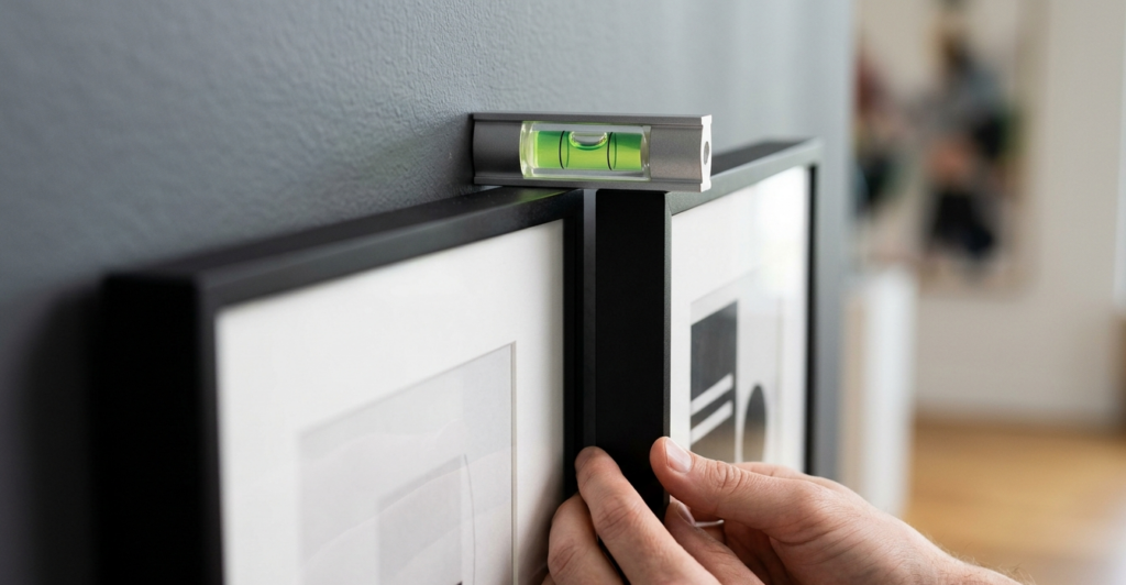
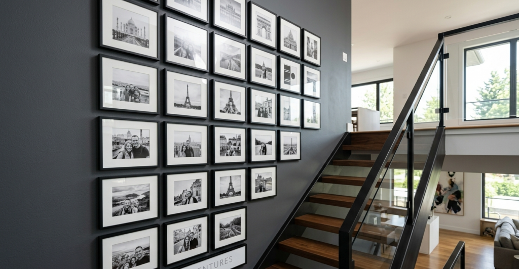
Layout 1: The Linear Grid (The “Safe” Bet)
If you love symmetry and order, the grid is for you. This works best with identical frames and a consistent theme (e.g., nine 12×12 frames in a 3×3 pattern).
- The Secret: Use a laser level. Even a 1/4 inch of misalignment is visible in a grid.
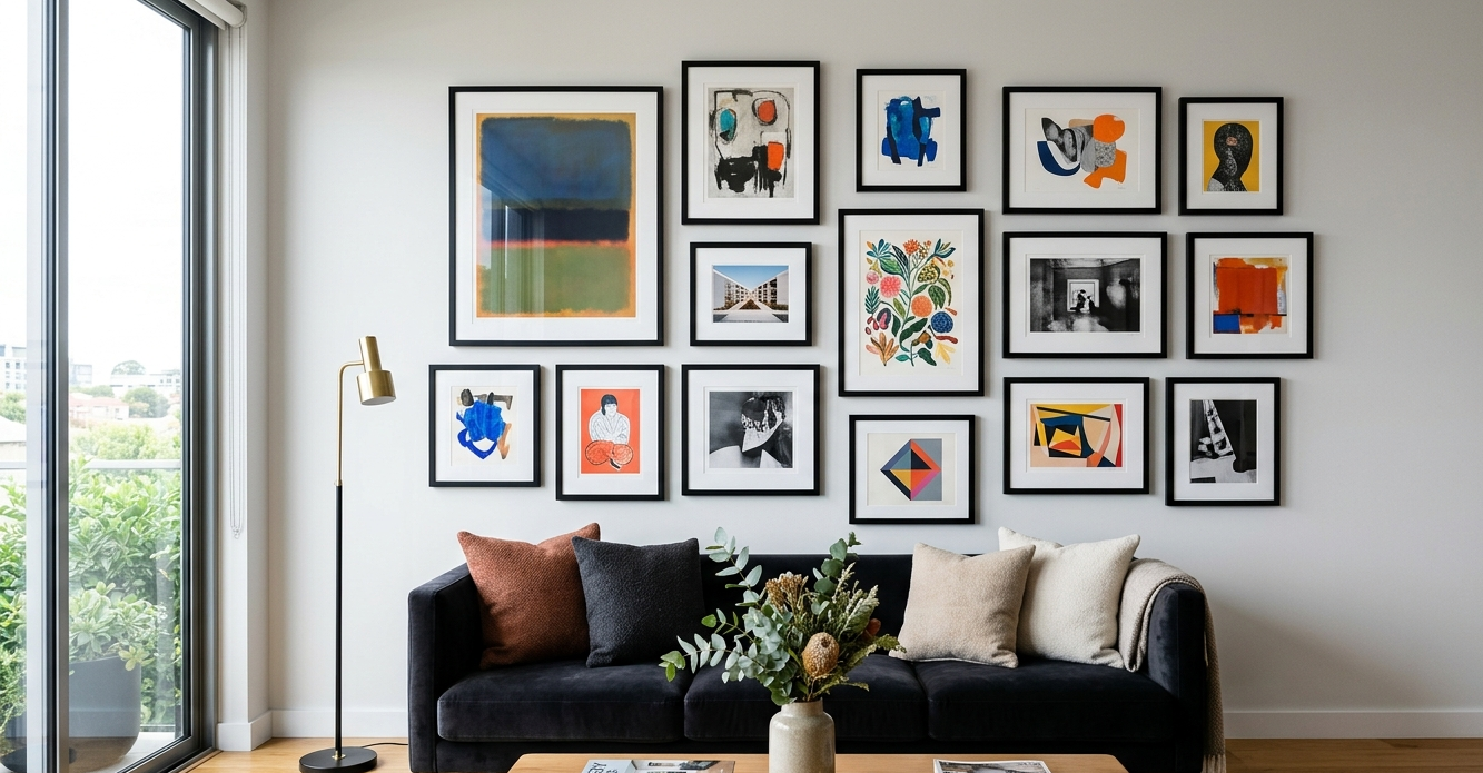
Layout 2: The Organic Cluster (The “Growing” Wall)
This is my personal favorite. It starts with one “anchor” piece—usually the largest—placed slightly off-center. You then build outward, maintaining a consistent gap (usually 2 to 3 inches) between frames.
- The Secret: Lay everything out on the floor first. Trace the frames on kraft paper, cut them out, and tape the paper to the wall using painter’s tape to visualize the flow before applying adhesive.
You might also enjoy:
- The Magic of Color: Ultimate Accent Wall Guide
- Best Warm Neutrals for Dark, North-Facing Rooms
- The Rug Layering Guide: Adding Bedroom Texture
Room-by-Room Application: Tailoring the Look
The Living Room: The Statement Maker
In the living room, the gallery wall should speak to the scale of your furniture. If you have a large sectional, a tiny 3-piece gallery will look lost. I recommend spanning at least 2/3 the width of the sofa.
- Pro Tip: Integrate your television! Surround the screen with art to make the “black box” feel like part of the decor rather than an eyesore.
The Bedroom: The Sanctuary
The bedroom calls for a softer approach. Avoid heavy, dark frames directly above the headboard. Instead, opt for light woods, canvas wraps, or even framed textiles.
- Spatial Flow: Keep the bottom edge of the gallery about 6-10 inches above the headboard to maintain a sense of height.
The Kitchen: The Unexpected Gallery
People often forget the kitchen! A small, curated corner near a breakfast nook or above a sideboard adds immense character.
- Theme: I love using vintage menus, botanical herb prints, or even framed family recipes handwritten by a grandmother.
Pros and Cons: Aesthetics vs. Maintenance
| Feature | Pros (The “Yay!”) | Cons (The “Nay”) |
| Visual Impact | Instantly personalizes a room; hides wall imperfections. | Can feel cluttered if not planned properly. |
| No-Drill Methods | Zero damage; easy to swap art; great for renters. | Weight limits apply; adhesive can fail in high-humidity (bathrooms). |
| Eclectic Style | Allows for a “low-cost” decor update by swapping prints. | Dusting multiple frames can be time-consuming. |
The Designer’s Deep Dive: Why Spatial Flow Matters
When we talk about spatial flow, we’re talking about how the eye moves through a room. A gallery wall acts as a “speed bump” for the eyes—it slows the viewer down and encourages them to linger.
In my experience, the biggest mistake beginners make is hanging art too high. We call it “Gallery Sky-itis.” Art should be hung at eye level—roughly 57 to 60 inches from the floor to the center of the display. When using no-drill solutions, you have the luxury of “test-driving” the height. If it feels too high after a day, simply peel and restick.
Another key concept is visual weight. A large, dark-framed oil painting has more “weight” than a light, airy watercolor of the same size. To balance your wall, place “heavier” items toward the bottom or the center of the arrangement to ground the display.
Final Thoughts & The Expert Tip
Creating a gallery wall is an act of storytelling. It shouldn’t be finished in a single afternoon with a “gallery-in-a-box” kit from a big-box store. The most beautiful walls I’ve ever styled were those that grew over time—a print from a vacation here, a child’s drawing there, a thrifted frame found on a Sunday morning.
The Expert Tip: If you’re using Command Strips, wait 24 hours. Apply the strips to the frame, press it to the wall, then—this is the part everyone skips—remove the frame, leaving the wall-side strips to “cure” for a full day before re-attaching the art. It ensures your masterpiece doesn’t go “thump” in the night!
Your Turn to Create
I want to see your transformations! Whether you’re tackling a tiny hallway or a grand living room, remember that there are no “rules,” only guidelines. Your home should make you smile the moment you walk through the door.
Are you ready to stop staring at those blank walls? Pick your favorite palette, grab some painter’s tape, and start mapping out your story.
If you found these tips helpful, subscribe to our newsletter for more “Smart Renovation” hacks, and don’t forget to tag us in your gallery wall reveals!