I still remember the first project I tackled as a junior designer fifteen years ago. It wasn’t a sprawling mansion or a high-rise penthouse; it was a tiny studio apartment in the city where the client desperately wanted “open shelving” in her kitchen. At the time, I thought, “How hard can it be? You just put things on a shelf.”
Two hours later, I stood staring at a cluttered mess that looked more like a garage sale than a Pinterest board. That afternoon taught me a vital lesson that has stayed with me through hundreds of home renovations: styling is a language. If you don’t know the vocabulary, your shelves will just scream at you. Today, we’re going to master that vocabulary. If you’ve ever wondered how to style an open bookshelf without it looking cluttered, you are in the right place.
The Evolution of the “Shelfie”: Why We Love Open Storage
Open shelving isn’t a new concept, but its role in the modern home has shifted from purely utilitarian to a form of self-expression. Historically, shelves were hidden away—pantries were behind closed doors, and books were encased in heavy cabinets. However, as our homes became more open-concept, our storage followed suit.
In my experience, the “Shelfie” represents the heart of a home. It’s where we display our travels, our tastes, and our history. But there is a fine line between “curated” and “crowded”. The goal is to create spatial flow—allowing the eye to move smoothly across the arrangement without getting stuck on a jumble of objects.
The Foundation: Color Psychology and Palette Selection
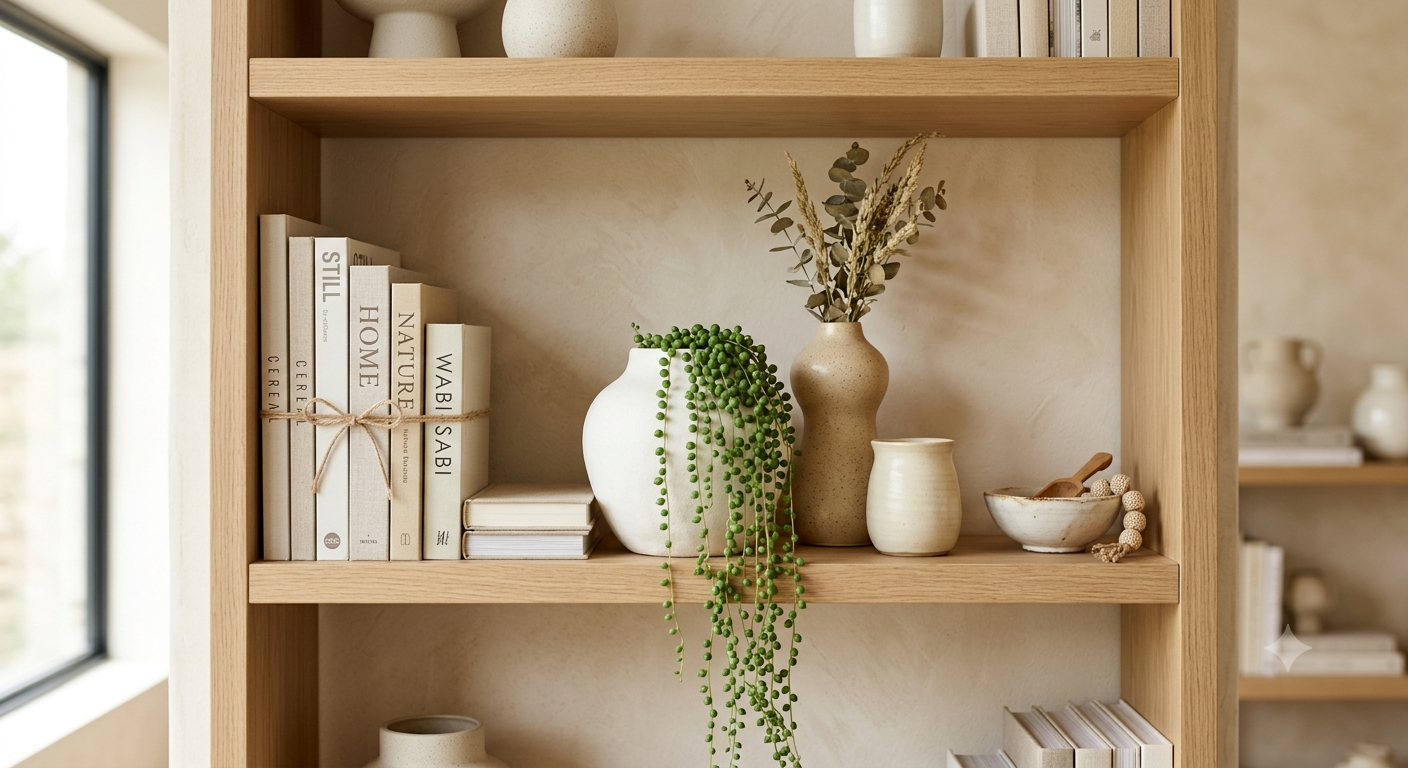
Before you even touch a book or a vase, you must decide on a color story. This is the single most important factor in preventing visual noise. In my fifteen years of styling, I’ve found that a limited palette is the “secret sauce” for high-end results.
Curating Your Color Story
I often suggest a 60-30-10 rule for shelf styling. 60% of your items should be in a primary neutral, 30% in a secondary color, and 10% in a metallic or high-contrast accent.
Hex Code Inspiration for a “Serene Organic” Shelf:
- Soft Linen (#F1E9DB): Perfect for the backdrop or larger ceramic pieces.
- Weathered Oak (#A68E74): Use this for the shelves themselves or wooden bowls.
- Deep Forest (#3B443C): Use sparingly for small sculptural items or book spines.
- Antique Brass (#B5A642): The “jewelry” of the shelf; use for small trays or frames.
When you keep your colors within a tight range, the variety of shapes becomes a feature rather than a distraction. If you have books with neon covers that don’t fit your aesthetic, don’t be afraid to turn them around (pages facing out) for a uniform, textural look.
Textural Contrast: The Designer’s Secret Weapon
If color is the melody, texture is the harmony. To avoid a “flat” looking shelf, you must mix materials. I have found that a shelf consisting only of books feels heavy, while a shelf with only glass feels invisible.
Material Pairing Guide:
Incorporate at least three of the following in every section of shelving:
- Matte vs. Gloss: Pair a rough, unglazed terracotta pot with a smooth, glazed porcelain figurine.
- Organic vs. Linear: Soften the hard edges of book stacks with the organic, flowing lines of a plant or a piece of driftwood.
- Soft vs. Hard: A small woven basket adds a “soft” tactile element that contrasts beautifully against the “hard” surface of marble bookends.
When I’m styling for clients, I look for textural contrast to create a focal point. A single sculptural bowl among paperbacks can act as a rest for the eyes, providing a sense of luxury and depth.
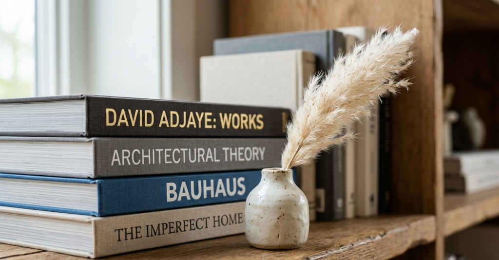
The Rule of Odds and the Pyramid Method
How do you actually place the items? I swear by the “Rule of Odds”. Items grouped in threes or fives are naturally more pleasing to the human eye.
The Pyramid Method: Imagine a triangle on your shelf. Your tallest item forms the peak. Two smaller items of varying heights form the base. This creates a dynamic spatial flow that prevents the shelf from looking like a straight line of soldiers.
Pro-Tip: Use book stacks (both horizontal and vertical) to create different elevations. A horizontal stack of three books serves as a “pedestal” for a small candle or glass beads. This layering adds height and prevents a “cluttered” feeling by organizing small objects into a singular visual unit.
Lighting: Casting the Right Shadow
You can have the most beautiful objects in the world, but if they are sitting in a dark corner, they lose their impact. Lighting is what transforms a bookshelf into a gallery.
In my residential styling, I advocate for three types of shelf lighting:
- Picture Lights: Mounted on the header of the bookshelf, these provide a sophisticated, library-esque glow.
- LED Strips: Tucked under the lip of each shelf, these create a “floating” effect and highlight textures.
- Rechargeable Sconces: Battery-operated puck lights or sconces are a game-changer for renters who cannot hardwire lighting.
Negative Space: The Power of “Nothing”
The biggest mistake people make when wondering how to style an open bookshelf without it looking cluttered is trying to fill every square inch.
Negative space is your best friend. In design, white space is what allows the featured items to “breathe”. I usually aim for about 20-30% of the shelf surface to remain empty. This creates a sense of airiness and intentionality. If a shelf is packed edge-to-edge, it’s no longer a “shelfie”—it’s storage.
“The Curator’s Choice”: 5 Must-Have Shelf Accessories
Throughout my 15-year career, these are the five “anchor” items I return to time and again to ensure a professional finish:
- The Oversized Art Print: Lean a piece of art (at least 11×14) against the back of the shelf to cover the “void”.
- The “Lifegiver” (Greenery): Every shelf needs a plant for movement and a living element.
- The Sculptural Object: Something that serves no purpose other than being beautiful, like a marble “chain” link.
- The Vessel: Vases, pitchers, or bowls provide necessary volume.
- The Personal Artifact: Something that tells your story, like a vintage brass compass or a piece of coral from a vacation.
Room-by-Room Application
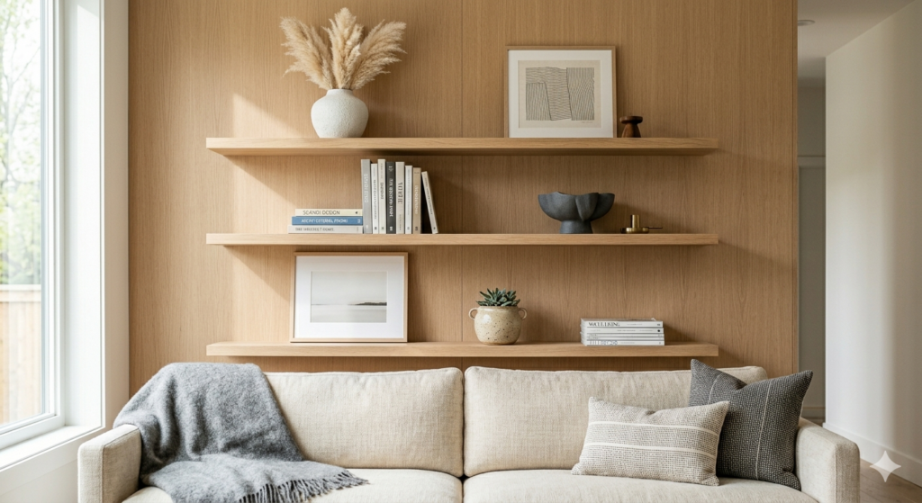
The Living Room: The Statement Piece
In the living room, shelves are often the focal point of the entire space. Focus on balance. If you have a TV nearby, keep the shelf styling quiet (neutrals and soft textures) so they don’t compete for attention.
The Bedroom: The Sanctuary
In the bedroom, styling should lean toward “calm”. This is not the place for bold, jarring colors. Stick to soft blues, creams, and natural wood. I love incorporating a small lamp on a bedroom shelf to provide soft, ambient light in the evenings.
The Kitchen: Function Meets Beauty
Kitchen open shelving is the hardest to keep clean but the most rewarding. The key here is repetition. Use sets of identical clear glass jars for dry goods to create a rhythmic pattern. Mix in functional beauty like a designer teakettle.
Pros and Cons of Open Shelving
| Pros (The Style) | Cons (The Maintenance) |
| Makes a room feel larger and airier. | Dust accumulation requires regular cleaning. |
| Allows for easy access to daily items. | Can look messy if items aren’t put back perfectly. |
| Personalizes the home with curated displays. | Not ideal for storing “ugly” but necessary items. |
You might also enjoy:
Fabric and Material Deep Dive: Elevating the Look
Adding “softness” to a hard wooden or metal shelf is a pro-level move. In many of my designs, I use fabric in three subtle ways:
- Linen-Wrapped Books: If you have mismatched books, you can wrap them in high-quality linen paper or fabric remnants for a cohesive, bespoke look.
- Woven Baskets: Sea-grass or hyacinth baskets are essential for hiding clutter like remote controls while adding warm texture.
- Velvet Accents: A small velvet-lined tray on a shelf can hold delicate items while adding a touch of old-world glamour.
Conclusion: Your Home is a Canvas
Styling open shelves is not about having the most expensive collection; it’s about the editing. It’s a rhythmic dance between what you love and how you present it. Remember, your home should be a reflection of you, not a showroom.
Final Expert Tip: Take a photo of your shelves once you think you’re finished. Seeing the arrangement through a camera lens helps you spot “holes” or “clumps” that your eyes might miss in person. It’s the fastest way to see if you’ve achieved that elusive spatial flow.
Ready to transform your space?
If you’re feeling inspired, grab a box, clear off one shelf today, and start with your foundation. Tag us in your “Shelfie” transformations using #SmartRenovationGuide—I can’t wait to see how you bring these tips to life!