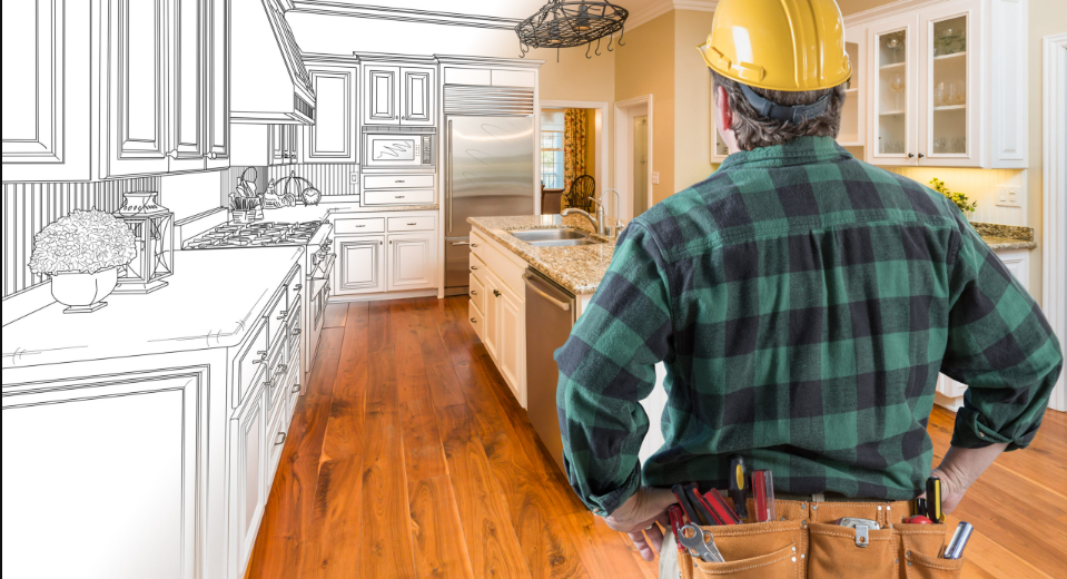
We have all been there. You walk into a room that was “cutting edge” five years ago, only to find that the trendy chevron rug and the specific shade of “millennial pink” now feel like a time capsule. In my fifteen years of documenting home transformations and styling residential spaces, I have found that the most beautiful homes aren’t the ones that follow every fleeting trend on social media. Instead, they are the ones built on a foundation of timeless interior design principles that never go out of style.
Creating a “forever home” isn’t about avoiding change; it’s about choosing a framework that allows your space to evolve without ever feeling obsolete. Today, I want to share the core philosophies I use at Smart Renovation Guide to ensure a home feels as fresh in a decade as it does the day the paint dries.
The Power of Symmetry and Architectural Balance
Long before we had digital mood boards, classical design relied on the concept of balance. Symmetry is a psychological shortcut to “calm.” When a room is balanced, our brains don’t have to work as hard to process the environment, leading to an immediate sense of serenity.
Why It Works
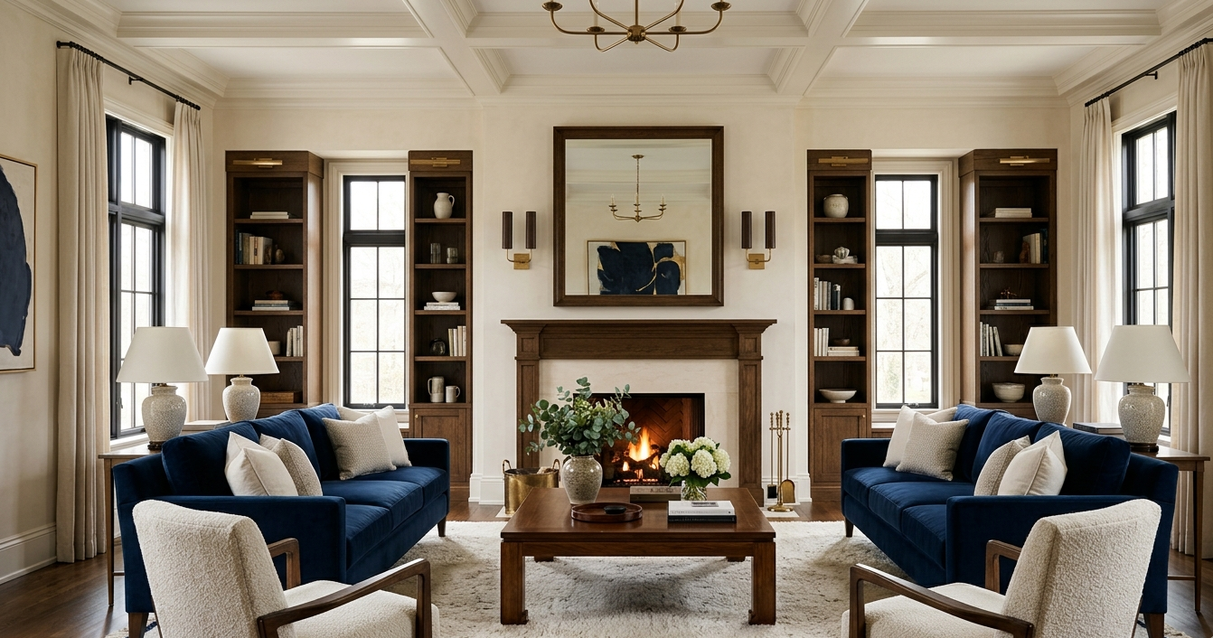
Historically, symmetry was the hallmark of grand estates and classical architecture. In a modern context, it provides a “focal point” that anchors a room. Whether it is a pair of identical armchairs facing a fireplace or matching nightstands flanking a bed, symmetry creates a visual rhythm that feels intentional and permanent.
How to Implement
- Identify Your Anchor: Every room needs a primary focal point. In a living room, this is often the fireplace or a large window.
- The Mirror Effect: Place identical items on either side of your anchor. This doesn’t mean your entire house should be a mirror image, but having one symmetrical “moment” per room establishes a sense of order.
The Rule of Natural Materials: Wood, Stone, and Linen
If there is one thing I have learned after a decade and a half in the industry, it is that synthetic materials date quickly. Plastic-heavy finishes or ultra-glossy “space-age” textures often lose their luster. Natural materials, however, develop a “patina”—a graceful aging process that adds character rather than looking worn out.
A Deep Dive into Textures and Fabric Choices
When selecting materials, I always tell my clients to think about the tactile experience. A home should feel as good as it looks.
- Linen: This is the ultimate timeless fabric. It is breathable, durable, and has a natural “slub” that provides textural contrast against smoother surfaces. I prefer heavy-weight Belgian linen for drapery and medium-weight for upholstery.
- Wool: A high-quality wool rug is an investment that pays off for twenty years. It naturally resists stains and maintains its “loft” or fluffiness far longer than polyester blends.
- Velvet: While it can feel trendy, silk or cotton-mohair velvet has been used in luxury interiors for centuries. It adds a layer of sophistication and depth that flat cotton simply cannot match.
Curating Your Material Palette
To achieve a timeless look, aim for a 70/30 split. 70% of your large surfaces (floors, sofas, cabinetry) should be natural materials like oak, marble, or cotton. Use the remaining 30% for your more adventurous, “of-the-moment” accents.
Mastering the Neutral Foundation (With Hex Code Suggestions)
Color psychology plays a massive role in how we perceive the age of a home. High-contrast, neon, or overly saturated “color of the year” choices can be jarring after the initial excitement wears off. A timeless home relies on a nuanced, neutral palette that allows your furniture and art to take center stage.
The “Smart Renovation” Timeless Palette
In my experience, the best neutrals have a slight “undertone” that shifts with the light. Here are three color directions I recommend:
- The Perfect Warm White:
- Hex Code: #F2F0E6
- Why: It avoids the clinical “hospital” feel of pure white but doesn’t turn yellow in evening light. It creates a soft, gallery-like backdrop.
- The Sophisticated Greige:
- Hex Code: #B7B1A5
- Why: A bridge between cool gray and warm beige. This is the ultimate “chameleon” color that works with both silver and gold hardware.
- The Deep Anchor (Navy/Charcoal):
- Hex Code: #2F353B
- Why: Use this for kitchen islands or accent built-ins. It provides a grounded, “expensive” feel without being as harsh as true black.
“The Curator’s Choice”: 5 Essential Timeless Pieces
Selection is the soul of styling. I have curated five types of furniture and accessories that have remained relevant for decades and will likely remain so for many more.
| Item | Why It’s Timeless | Styling Tip |
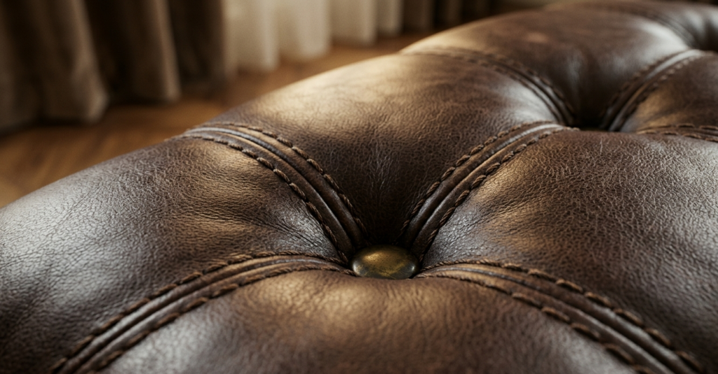
| The Chesterfield Sofa | Its deep tufting and rolled arms have been popular since the 18th century. | Opt for a neutral “Cognac” leather or a “Navy” velvet. |
| The Wishbone Chair | Hans Wegner’s 1949 design fits into Mid-Century, Scandi, or Traditional homes. | Use these around a heavy oak dining table to lighten the visual weight. |
| The Jute/Sisal Rug | Natural fiber rugs provide an earthy base that never competes with other patterns. | Layer a smaller, colorful Persian rug on top for extra warmth. |
| Black-Frame Windows | Reminiscent of industrial lofts and old greenhouses, they frame views like art. | If you can’t replace windows, use black-framed mirrors to mimic the look. |
| The Sarcophagus-Style Planter | Classical stone or terracotta planters add history and “life” to any corner. | Use oversized olive trees or fiddle-leaf figs for height. |
Room-by-Room Application: Implementing the Classics
The Living Room: Prioritizing Spatial Flow
In the living room, timelessness is achieved through spatial flow. Avoid the “dorm room” layout where all furniture is pushed against the walls. Pull your seating in toward the center to create a “conversation circle.” I have found that using a large-scale coffee table as a central focal point helps ground the room’s energy.
The Bedroom: A Sanctuary of Softness
For the bedroom, focus on “quiet luxury.” Layering is key here. A timeless bedroom features a high-quality upholstered headboard, crisp white bedding, and a “throw” blanket in a contrasting texture like chunky knit or cashmere. Avoid “bedroom sets” where every piece matches perfectly; instead, mix a wooden dresser with painted nightstands for a curated, evolved look.
The Kitchen: Functional Elegance
While I won’t touch on the plumbing, from an aesthetic standpoint, the “Shaker-style” cabinet remains the gold standard. Its clean lines are neither too ornate nor too modern. Pair them with natural stone countertops (like marble or soapstone) and unlacquered brass hardware that will age and develop a beautiful patina over time.
The Magic of Lighting: Layering for Atmosphere
Lighting is the “jewelry” of the home. One of the most common mistakes I see is relying solely on overhead “can” lights. A home that never looks dated uses three layers of lighting:
- Ambient: The general light (natural sunlight or soft overheads).
- Task: Focused light for reading or cooking.
- Accent: Sconces, picture lights, or floor lamps that highlight architectural features.
Expert Tip: Always choose “warm” bulbs (around 2700K). Cold, blue light can make even the most expensive furniture look cheap and dated.
Pros and Cons: Timeless vs. Trendy
Before you commit to a design direction, it is important to understand the trade-offs.
The Timeless Approach
Pros:
- Cost-Effective: You won’t feel the need to redecorate every three years.
- High Resale Value: Potential buyers are drawn to neutral, balanced homes.
- Ease of Evolution: It is easy to swap a pillow or a piece of art to freshen up a classic room.
Cons:
- Higher Initial Investment: Quality natural materials and classic furniture often cost more upfront.
- Maintenance: Real wood and stone require specific care (oiling, sealing) compared to plastic laminates.
The Trend-Driven Approach
Pros:
- **Instant# Design Classics: 7 Timeless Principles for a Home That Never Looks Dated
We have all been there: standing in the middle of a room that felt cutting-edge five years ago, only to realize it now feels like a time capsule of a passing fad. I remember early in my career, helping a client who had fully embraced the “Ultra-Neon Memphis” revival of the moment. Two years later, the space felt frantic rather than fresh.
That project was a turning point for me. It sparked a fifteen-year obsession with the “why” behind certain spaces—why some rooms feel just as elegant today as they did in a 1950s architectural digest. Timeless interior design principles that never go out of style aren’t about avoiding trends; they are about building a foundation so strong that trends can come and go without ever shaking the soul of the home.
In this guide, we will explore the visual harmony and lifestyle choices that create a lasting aesthetic. We aren’t looking at structural codes or technical blueprints; we are looking at the art of the “forever home” through the lens of a curator.
The Power of Architectural Symmetry and Balance
Long before we had modern design software, the ancients understood that the human eye seeks equilibrium. Symmetry creates a sense of “visual rest.” When a room is balanced, your brain doesn’t have to work hard to process the space, which leads to an immediate feeling of calm.
The Formal vs. Informal Balance
In my experience, formal symmetry—where one side of the room is a mirror image of the other—works best in “static” areas like the dining room or a formal entryway. Think of a central console table flanked by two identical lamps.
However, for a lived-in feel, I prefer Asymmetrical Balance. This involves balancing a large object (like a heavy velvet sofa) with two smaller ones (like a pair of slender armchairs) on the opposite side. It maintains the “weight” of the room without feeling like a museum exhibit.
The Psychology of the “Quiet” Palette
Color is the most emotional tool in a designer’s kit. To achieve a look that defies decades, we must look toward a “Quiet” palette. This doesn’t mean a room must be beige, but it does mean the base should be rooted in tones found in nature.
Deep Dive: The Timeless Color Spectrum
Over the years, I’ve found that the most successful homes use a 60-30-10 rule. 60% is a dominant neutral, 30% is a secondary supporting color, and 10% is a bold accent.
The “Heirloom” Palette Recommendations:
- The Canvas (60%): Alabaster White (Hex: #F2F0E6) or Stone Grey (Hex: #918E85). These provide a warm, reflective quality that adapts to changing light throughout the day.
- The Depth (30%): Midnight Navy (Hex: #2C3E50) or Sage Leaf (Hex: #77815C). These colors add “gravity” to a room, making it feel grounded.
- The Spark (10%): Antique Brass (Hex: #B5A642) or Terracotta (Hex: #CC7722). These accents provide the warmth that keeps a neutral room from feeling clinical.
By keeping the most expensive “fixed” items (sofas, rugs, wall paint) in the canvas and depth categories, you allow yourself the freedom to swap out the “spark” items as your personal taste evolves.
You might also enjoy:
Textural Contrast: The Secret to Visual Longevity
If a room feels “flat,” it usually isn’t a color problem—it’s a texture problem. Textural contrast is the practice of layering materials so that the eye is constantly discovering new surfaces.
Deep Dive: Fabric and Material Selection
In my fifteen years of styling, I have learned that natural fibers are the ultimate investment. Synthetic fabrics often have a “sheen” that can look dated or wear poorly.
- Linen: The “linen look” is perhaps the most timeless fabric in existence. It has a natural slub and an organic drape that looks better as it ages. Whether used for heavy floor-to-ceiling drapes or a slipcovered sofa, it brings an air of effortless luxury.
- Velvet: Specifically, matte cotton velvet. It absorbs light and provides a deep, rich saturation of color. A velvet accent chair in a library or bedroom provides a tactile “hug” that never loses its appeal.
- Woven Natural Fibers: Think Jute, Sisal, and Seagrass. These materials bring the outdoors in. A chunky jute rug under a sophisticated wool rug is a classic “designer secret” for adding immediate soul to a new construction home.
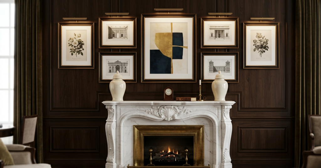
Establishing a Singular Focal Point
Every great room needs a “hero.” Without a focal point, the eye wanders aimlessly, creating a feeling of restlessness. In a timeless home, the focal point is usually an architectural feature or a significant piece of art.
If your room doesn’t have a natural focal point like a fireplace, you must create one. I often suggest a large-scale gallery wall or an oversized arched mirror. The key is scale. Small, “fidgety” decor items scattered around a room create clutter; one large, intentional piece creates a statement.
The “Curator’s Choice”: 5 Pieces That Never Age
When I am asked what to invest in, I always point toward these five categories. These are the “little black dresses” of interior design.
| Item | Why It’s Timeless | Styling Tip |
| The Chesterfield Sofa | Its deep tufting and rolled arms have been popular since the 1800s. | Opt for a Cognac leather or a Moss Green velvet to keep it feeling modern. |
| The Wishbone Chair | Hans Wegner’s 1949 design is the pinnacle of organic minimalism. | Use these around a rustic oak dining table for a beautiful “old meets new” contrast. |
| The Persian or Oushak Rug | These patterns hide wear and tear while adding a sense of history. | A vintage rug is the best way to make a brand-new house feel like it has a story. |
| Brass Sconces | Quality metalwork ages beautifully and provides “jewelry” for the walls. | Place them at eye level in hallways to create a high-end hotel ambiance. |
| The Carrara Marble Plinth | Whether it’s a coffee table or a small pedestal, natural stone is eternal. | Pair the coldness of marble with the warmth of a stack of linen-bound books. |
Room-by-Room Application: The Practical Guide
How do we take these abstract principles and apply them to the daily flow of your home? Let’s break it down.
The Living Room: The Social Anchor
The living room should focus on Spatial Flow. Avoid pushing all furniture against the walls—this is a common mistake that makes a room feel like a waiting room. “Float” your seating arrangement in the center of the space. Ensure there is a conversational circle where people can talk without raising their voices.
- Expert Tip: Use a large-scale rug to “zone” the seating area. If the rug is too small, the furniture looks like it’s floating in an ocean.
The Bedroom: The Sensory Retreat
In the bedroom, timelessness is achieved through Soft Minimalism. Focus on the bed as the primary focal point. Use high-thread-count cotton or linen bedding in white or ivory.
- Expert Tip: Layer different tones of the same color (e.g., champagne, cream, and sand) to create a “cloud-like” effect that feels like a five-star suite.
The Kitchen: Functional Elegance
While I avoid structural advice, from an aesthetic standpoint, the “all-white kitchen” remains a classic for a reason: it’s a clean slate. To keep it from feeling cold, introduce natural wood elements—perhaps a set of oak barstools or a large wooden dough bowl on the island.
- Expert Tip: Swap out standard cabinet hardware for unlacquered brass. It will develop a beautiful patina over time, signaling that the home is well-loved.
Pros and Cons: Aesthetics vs. Maintenance
When choosing a timeless path, it is important to be realistic about how you live.
Pros of Timeless Design:
- Increased Resale Value: Potential buyers are not turned off by neutral, high-quality finishes.
- Sustainable Choice: Buying quality once is better for the planet (and your wallet) than replacing “fast furniture” every two years.
- Reduced Decision Fatigue: Once the foundation is set, you don’t have to rethink your entire home every time a new trend hits Pinterest.
Cons of Timeless Design:
- Higher Initial Investment: Quality materials like solid wood, marble, and linen cost more upfront.
- Maintenance of Natural Materials: Marble can stain, and linen wrinkles. You have to embrace the “perfectly imperfect” look of natural aging.
Conclusion: Living with Intention
Creating a home that never looks dated is not about being “safe” or “boring.” It is about having the confidence to choose items that speak to your soul rather than the current algorithm. In my fifteen years of documenting home transformations, the most beautiful houses are always the ones that feel curated, not decorated.
My Final Expert Tip: The “20-Year Rule.” Before you make a major purchase, ask yourself: “Could I see myself sitting in this chair/looking at this color twenty years from now?” If the answer is an immediate “yes,” you have found your classic.
Ready to transform your space? Browse our [Curated Gallery of Design Styles] or subscribe to the Smart Renovation Guide newsletter for weekly inspiration on creating a home that grows with you.
Follow your intuition, trust the classics, and your home will always be in style.