
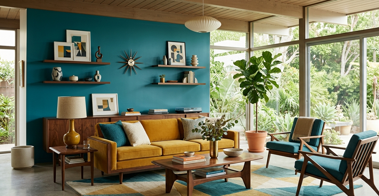
As we move into 2026, we are seeing a magnificent evolution of this timeless style. We are moving past the “safe” grays and whites of the last decade and embracing a richer, more nuanced approach. If you’ve been looking for Mid-century modern living room color palettes for 2026, you’ve come to the right place. Let’s dive into how we can make your home a masterpiece of retro-futurism.
The Resurgence of Mid-Century Modern (MCM) in 2026
The enduring appeal of Mid-Century Modern design lies in its optimism. Born out of the post-WWII era, it was a style that looked forward. In 2026, our homes have become our sanctuaries, and the MCM philosophy of “form follows function” paired with an “organic-meets-geometric” aesthetic feels more relevant than ever.
The DNA of the Style: Beyond the Tapered Leg
While most people recognize the iconic Eames lounge chair or the tapered “peg” legs on a sideboard, the real magic happens in the spatial flow. MCM design is about breaking down the barriers between the indoors and outdoors. It’s about textural contrast—pairing a smooth, cold marble coffee table with a chunky, hand-woven wool rug. In my experience, the color palette is the glue that holds these disparate materials together.
The Art of the Palette: 10 Bold Choices for 2026
Selecting a palette isn’t just about picking colors you like; it’s about creating a focal point and managing the visual weight of a room. Here are ten curated palettes that I am personally implementing in high-end residential projects this year.
1. The “Neo-Classic” Harvest
This is an elevated take on the traditional 1960s kitchen colors. We are swapping “avocado” for “deep moss” and “burnt orange” for a sophisticated “terracotta sunset.”
- Deep Moss: #4B5320
- Terracotta Sunset: #C2452D
- Warm Parchment: #F5E9DB
2. Midnight & Walnut
For those who love drama. This palette focuses on the deep, rich tones of American Walnut wood contrasted against a dark, moody blue.
- Midnight Navy: #191970
- Walnut Stain: #432616
- Antique Brass: #CD950C
3. The Desert Modernist
Inspired by the high desert of Joshua Tree. This palette utilizes soft pinks and sandy beiges to create a serene, airy feel.
- Dusty Rose: #C08081
- Sandstone: #D6C2A1
- Sagebrush: #77815C
4. Bauhaus Primary 2.0
A nod to the roots of MCM. It uses bold primary colors but desaturates them just enough to feel livable in a 2026 context.
- Mustard Seed: #E1AD01
- Slate Blue: #4682B4
- Oxblood Red: #60100B
5. The Verdant Atrium
Bringing the outdoors in with layers of green. I have found that using varying shades of the same color creates a sophisticated, monochromatic “jungle” vibe.
- Forest Floor: #223026
- Mint Julep: #E0EED4
- Golden Oak: #9E713F
6. Electric Citron & Concrete
A high-contrast palette for the daring. The cool, industrial feel of concrete is energized by a pop of neon-adjacent yellow.
- Electric Citron: #DFFF00
- Cool Shale: #8E918F
- Charcoal: #36454F
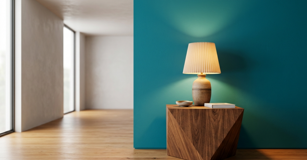
7. Soft Minimalist Teal
Teal was a staple of the 50s, but here we pair it with soft, warm whites and light ash woods for a contemporary “scandi-midmod” hybrid.
- Moody Teal: #006D6F
- Ash Wood: #CDBA96
- Cotton Bloom: #F8F9F5
8. The Smoked Honey Suite
Warm, golden, and incredibly cozy. This palette works wonders in rooms with limited natural light.
- Smoked Honey: #D4AF37
- Mushroom: #9A8B7C
- Burnt Umber: #8A3324
9. Lavender & Lead
A surprising but stunning combination. Lavender provides a soft, feminine touch that balances the heavy, masculine weight of dark gray or “lead” accents.
- Twilight Lavender: #967BB6
- Lead Gray: #5A5A5A
- Silver Birch: #E5E4E2
10. The Graphic Monochrome
For the purists. A strictly black, white, and wood-tone palette that relies entirely on geometric patterns for visual interest.
- True Obsidian: #0B0B0B
- Pure Alabaster: #F2F0EA
- Raw Teak: #B38B6D
You might also enjoy:
- Timeless Interior Design: 7 Principles That Never Age
- Brighten Up: Clever Decor for Low Natural Light
- Industrial Chic: How to Get the Loft Aesthetic
Deep Dive: Texture, Fabric, and Material Selection
Color is only half the battle. To truly capture the 2026 MCM aesthetic, you must master the tactile experience.
The Power of Bouclé and Velvet
In 2026, we are seeing a massive shift toward performance fabrics. While the 1950s relied on scratchy wools, today we use luxury bouclé—a knotted, textured fabric that adds incredible depth to a neutral palette. When I design a living room using the “Midnight & Walnut” palette, I almost always suggest a navy velvet sofa. Velvet absorbs light in a way that makes deep colors feel infinite and luxurious.
Natural Woods: The Soul of MCM
You cannot have Mid-Century Modern without wood. However, the trend for 2026 is moving away from the orange-tinted stains of the past. We are looking for matte finishes that celebrate the natural grain of Teak, Walnut, and Rosewood.
- Teak: Best for the “Desert Modernist” palette. It has a natural warmth that feels like sunshine.
- Walnut: The “gold standard.” Its dark, swirling grain provides the necessary gravity for bolder colors like Oxblood or Electric Citron.
Metal Accents: The Jewelry of the Room
Brass remains king, but for 2026, we are seeing a move toward brushed champagne gold and satin nickel. These finishes are softer and less “glam” than the high-shine golds of five years ago. Use them for floor lamps, cabinet pulls, and the tips of chair legs to create a cohesive visual rhythm throughout the house.
The Curator’s Choice: 5 Essential MCM Elements for 2026
If you are looking to refresh your space without a full overhaul, focusing on these five categories will give you the most “bang for your buck.”
1. The Statement Lounge Chair
Every MCM living room needs a “throne.” In 2026, I’m steering clients toward the Womb Chair or the Papasan-inspired swivel chairs in bold hues like mustard or rust. It serves as an instant focal point.
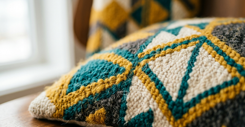
2. Geometric Flatweave Rugs
Rugs are the “fifth wall.” Look for low-pile, hand-tufted rugs that feature asymmetrical patterns. A rug with a bold, oversized geometric print can anchor a room and pull together every color in your chosen palette.
3. Sputnik & Articulated Lighting
Lighting is the easiest way to signal Mid-Century intent. An articulated “Grasshopper” floor lamp or a classic Sputnik chandelier provides the sculptural silhouette that defines this era.
4. Floating Sideboards (Credenzas)
The long, low profile of a floating credenza is essential for maintaining spatial flow. It provides storage without the visual bulk of traditional cabinetry. I recommend a piece with “slatted” doors to add a layer of linear texture.
5. Abstract Ceramic Art
Accessorizing is where you can play with the more “wild” colors of your palette. Hand-thrown ceramics in matte glazes—think organic, bulbous shapes—add a human touch to the clean lines of the furniture.
Room-by-Room Application
The Living Room: The Social Hub
In the living room, your palette should be at its most energetic. This is where you use your “primary” and “secondary” colors. For instance, if you choose the “Neo-Classic Harvest”, your sofa might be the Deep Moss, while your accent pillows and rug carry the Terracotta and Parchment tones.
The Bedroom: The Serene Retreat
Here, we dial down the saturation. Take the “Midnight & Walnut” palette and lean heavily into the Midnight Navy for the walls to create a “cocoon” effect. Use the Walnut wood for the bed frame and keep the bedding in a crisp, neutral cream to maintain a sense of cleanliness.
The Kitchen: The Functional Gallery
MCM kitchens in 2026 are moving away from all-white. Imagine a kitchen with lower cabinets in Sagebrush green, a white quartz countertop, and open shelving in Warm Oak. It feels fresh, organic, and incredibly high-end.
Pros and Cons of the Bold MCM Look
| Feature | The Aesthetic Pro | The Functional Con |
| Dark Paint Colors | Incredible depth and “mood”; makes art pop. | Can show scuffs and fingerprints more easily. |
| Low-Profile Furniture | Creates a sense of height and “airiness” in small rooms. | Can be difficult for those with mobility issues to sit/stand. |
| Velvet Fabrics | Luxurious feel and high visual impact. | Requires regular steaming and brushing to avoid “crushing.” |
| Open Floor Plans | Enhances light and social interaction. | Can lead to acoustic issues (echoing) without enough textiles. |
Expert Tip: The 60-30-10 Rule
To prevent a bold palette from becoming overwhelming, I always use the 60-30-10 rule.
- 60% of the room should be your dominant color (usually walls or rugs).
- 30% is your secondary color (upholstery).
- 10% is your “pop” or accent color (art, pillows, accessories).
This ratio ensures that even the most “daring” colors feel balanced and intentional rather than chaotic.
Ready to Redefine Your Home?
The Mid-Century Modern style is more than just a trend; it’s a celebration of thoughtful living. By embracing these bold palettes for 2026, you aren’t just decorating a house—you’re curating a lifestyle that values beauty, simplicity, and a touch of vintage soul.